The psychology of colors is a powerful tool that allows us to direct the energies we are unknowingly exposed to in our living spaces. Choosing colors in your home is not just a visual preference—it also plays a vital role in emotional balance.
If you think the colors in your home are only about aesthetics, think again. Colors have a profound impact on the subconscious mind. They can uplift our mood, raise our energy, or conversely, slow us down. This is exactly why the meanings behind colors make such a difference in interior design. In this article, we’ll explore how to create a balanced energy flow in your home using not only primary colors like red, blue, and yellow, but also pastel shades, secondary hues, and vibrant tones. Let’s discover what each color represents and how it affects the energy in different spaces.
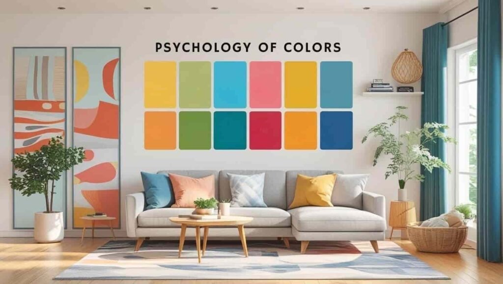
What Is Color Psychology?
Color psychology is the study of how colors influence human behaviors, thoughts, and emotions. Colors used in decoration don’t just serve aesthetic purposes—they also send subtle messages to our subconscious. Each color triggers a different emotional response. For example, blue provides calm, red stimulates, green brings balance, and yellow boosts energy. By bringing these effects into your home consciously, you can create living spaces that align with your emotional well-being.
1. Red: Passion, Courage, and the Power to Act
Red is directly linked to the root chakra and symbolizes survival instincts, physical strength, and passion. It energizes you, motivates action, and instills confidence. However, due to its intensity, it should be used with care.
Red adds bold character to a space. In the dining room, it can increase appetite; in entryways, it offers a warm welcome. Too much red, though, may cause tension or restlessness.
If you’re seeking more courage and vitality in your life, incorporating red tones in a balanced way can support you.
Pastel alternative: Burgundy, terracotta, or dusty rose offer a more grounded energy.
2. Blue: Inner Peace, Trust, and Mental Calm
In the language of color, blue is a soothing hue that reduces stress and anxiety. It is associated with the water element and supports trust and loyalty. Blue creates a meditative effect, especially for those who overthink or experience mental fatigue.
It supports restful sleep in bedrooms and emotional cleansing in bathrooms. Blue also enhances intuition and promotes mental clarity.
If you’re looking for mental peace, consider using light blue and ocean-inspired shades to build a tranquil atmosphere.
Pastel alternative: Ice blue, seafoam green, or soft sky tones.
If you feel drawn to the calming energy of blue, you can check out our blue poster in the Etsy shop here.
3. Yellow: Joy, Inspiration, and Mental Brightness
Yellow channels the sun’s energy and boosts inner motivation. It represents joy, optimism, and mental stimulation. Like early morning sunlight, yellow warms the spirit and fosters creativity and learning.
In workspaces, it stimulates the mind; in kitchens, it creates a welcoming vibe. Yellow helps individuals reconnect with their inner spark, especially after emotional lows. Lemon yellow is bright and energizing.
Pastel alternative: Vanilla, light yellow, or mustard tones provide a softer, more balanced feeling.
If yellow speaks to your inner joy and creativity, you might want to see our uplifting yellow poster in our collection here.
4. Green: Balance, Hope, and Connection to Nature
Green is associated with the heart chakra and symbolizes emotional harmony. As the color of nature, green brings peace and vitality wherever it’s used. It represents renewal, growth, and hope. It eases mental fatigue and promotes emotional restoration.
Being surrounded by green helps reconnect with nature. When combined with houseplants, it refreshes the home’s energy. If you desire more balance and peace within, green tones can accompany you on that path.
For those who resonate with the refreshing harmony of green, our green poster could be the perfect fit—discover it in our shop here.
Pastel alternative: Sage green, mint, or olive tones create a modern and natural look.
5. Purple: Spiritual Depth, Intuition, and Creativity
Purple is aligned with the crown chakra and symbolizes spiritual growth, intuitive clarity, and wisdom. It enhances inner connection, especially in spaces for meditation, yoga, or reflection.
It’s also the color of luxury, elegance, and artistic imagination. In bedrooms or quiet corners, purple creates deep serenity. For those seeking inner guidance, it acts like a doorway inward. If you’re inspired by the spiritual depth of purple, you can explore our purple poster designed for mindful spaces here.
Pastel alternative: Lavender, lilac, or violet tones offer gentle transitions and spiritual lightness.
6. Orange: Vitality, Sociability, and Creative Energy
Orange awakens the inner child—it’s spontaneous, joyful, and energetic. It enhances social interaction, inspires creativity, and elevates motivation. For those who struggle to get moving in the mornings, orange can spark internal awakening.
It enhances appetite in dining areas and strengthens bonds in communal spaces. For creatives, orange provides motivational fuel. It’s ideal for building warm, lively, and sincere environments.
Pastel alternative: Salmon, peach, or melon tones give off soft social warmth.
7. White and Neutral Tones: Purity, Clarity, and Inner Lightness
White symbolizes new beginnings, clarity, and openness. It also represents simplicity and emotional decluttering. When paired with neutrals, white creates a calm and open foundation.
For those embracing a minimalist lifestyle, white offers a feeling of inner lightness. When combined with beige, cream, or soft gray, it balances the overall energy. White also serves as a neutral backdrop that enhances other colors.
Pastel and neutral tones: Linen, stone gray, and sandy beige provide warmth and elegant simplicity.
And if pink is your color for softness and emotional warmth, our pink poster is waiting for you—find it in our Etsy store here.
Intermediate Colors & Self-Expression in the Psychology of Colors
In home decor, not just primary colors—but also in-between tones—make a big difference. Blush pink, taupe, earth tones, or pastel coral bring both personality and calm.
Pastels: Offer emotional lightness and subtle elegance. Ideal for introverts or those seeking peace.
Vibrant tones: Convey boldness and visibility. When balanced well, they create energetic harmony.
Combinations to try:
- Blue & White → Clarity and freshness
- Green & Beige → A grounded, peaceful environment
- Yellow & Gray → A modern, productive, and dynamic space
Design Living Spaces That Reflect the Psychology of Colors
Your home is not just a physical environment—it reflects your soul. Every color you choose sends a message to your subconscious. The rooms you spend time in can either empower or drain your energy.
So, when decorating, don’t just follow trends—tune into your inner world. The psychology of colors provides a powerful guide. When you understand what each shade represents, you can create an atmosphere that truly supports your emotional well-being.
Remember: Color is not only seen with the eyes—it is felt through the heart. General color meanings can guide you, but always listen to your own intuition and explore your favorite shades.
If you love the harmony of all these colors together, you can find our complete five-piece “I Trust My Voice” poster set in our Etsy shop here.
Or explore our collection of digital posters designed with color psychology in mind at the ZenAuraPrint Etsy store—crafted to align with your energy.
Each color has its own energy. Blue and lavender are perfect for bedrooms due to their calming nature. Yellow and orange bring energy to kitchens or creative corners. Green and beige balance common living areas.
Yes, scientific studies support this. Colors influence us subconsciously and affect emotional states. The right color selection can lead to a calmer, more vibrant, or more creative home.
That depends on your lifestyle and emotional needs. Vibrant colors energize and stand out, while pastels soothe and bring grace. Ideally, blending both creates aesthetic and emotional harmony.